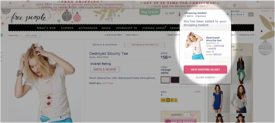
Enclosed checkout process significantly decreases the risks of shopping cart abandonment simply because buyer is not unfocused by advertisements, headlines or any other visual or audio distractions. The successful checkout process is very clear and straightforward. The buyer is able to see the mandatory steps that need to be done in order to complete the purchase which commonly are; About you, Billing Address, Shipping Address, Payment and Confirm & Pay. By providing buyer with these steps, the customer is aware of what information will be required and how long the checkout process is approximately going to take.
I found a good article on Mashable.com called 7 Mistakes to Avoid on Your Ecommerce Site written by Todd Wasserman that focuses exactly on enclosed and fast check out process. Wasserman states that; “If you’re asking consumers to take more than five steps to buy something off your site, then you’re asking too much. Compuware recommends the following:
- Welcome/cart contents page
- Bill-to section
- Ship-to section
- Payment module
- Confirmation/thank you page” (Wasserman, 2012).
In order to decrease shopping cart abandonment, an effective e-commerce site will have an Authentic Secure company logo displayed somewhere on the screen. This Authentic Secure company logo is frequently located at the corners of a webpage and at the checkout process to keep browsers/customers reminded that their private information is secure and protected. The choice of placing the Authentic Secure logo at the checkout process webpage is to create customer confidence and trust between the buyer and the e-commerce site. A good e-commerce site is trying to influence the buyer that all information entered is secure and protected; therefore, buyer can feel safe and comfortable. The buyer is able to focus only on completing the purchase only.
Another feature that effective e-commerce sites have is being able to see the total amount of money for products/services that customer selected in shopping cart at all times. A good tactic is placing the shopping cart icon at the top right corner of every page with the total amount displayed in clear font so when shopper is still browsing, he/she is able to see the total amount without being forced to actually click on shopping cart. This feature significantly decreases cart shock, leading to shopping cart abandonment.
Furthermore, additional suggestion that Daniel Alves points out in How to Design an Ecommerce Site to Maximize Sales article on Mashable.com is regarding the ‘Add to Cart’ button. ‘Add to Cart’ is; “It’s your most important button, so don’t hide it. Use bold colors that contrast well with your design and attract attention. Try choosing a color that is not used anywhere else in the design to really set it apart. By making the button plainly visible, shoppers won’t have to wonder how to add items to their shopping carts. Any time spent searching for the “Add to Cart” button is time in which the shopper will reconsider her motivation to purchase.” (Alves, 2012).


